

The Monochrome Trap: Why Your Digital Gradients Look Like Mud in Print
If you draw digitally, you’ve probably fallen into this trap before. You’re working in Clip Studio Paint or Photoshop, you want a smooth shadow across a character's jacket or a soft atmospheric sky, so you grab a soft airbrush tool. You slap a smooth grey gradient across the panel, step back, and admire it. On your bright, backlit monitor, it looks buttery smooth and gorgeous.
Then you print it out, and it looks like complete splotchy mud.
Or, maybe you’re reading a web comic or manga and it suddenly looks muddy or flat. (Maybe it was my own manga Game Over. Hey. We all make mistakes! And I learned from them.)
Understanding why this happens is one of the biggest leaps an artist makes when transitioning from digital illustrations to printable manga art. It all comes down to a fundamental concept that trips up tons of creators: the difference between greyscale and monochrome.
Now that I’m adapting Game Over for tone and am working on a one-shot where it’s necessary, I figured I’d break some of it down here for you to help you understand what’s going on with your own art or what you’re looking at when you read manga and web comics.
Greyscale vs. Monochrome
When people talk about black and white art, they usually think of greyscale. Greyscale images use thousands of shades of grey, blending black and white pixels together to simulate soft lighting.
Manga printing presses do not work in greyscale. Manga is printed in monochrome.
Monochrome literally means one color. In traditional manga printing, there is no grey ink loaded into the press, and it isn't using CMYK to adjust the depth of the blacks either. Every single microscopic drop of ink that hits that paper is 100% pure black ink on 100% white paper.
When you export a file as a monochrome image, your software forces every single pixel to choose a side. There is no middle ground. If you feed a soft digital gradient to a monochrome printer setup, the software panics trying to translate those middle grey tones. It forces them into weird, hard black blobs or patchy white holes. The silky atmospheric sky you spent twenty minutes painting suddenly looks like a printer glitch.
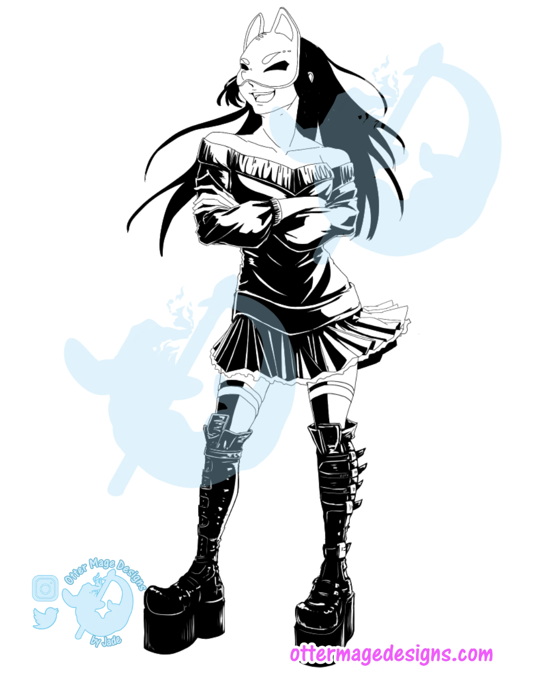
The Power of Beta (ベタ)
So, how do we build dynamic lighting, heavy drama, and deep shadows when we only have pure black ink to work with?
We use Beta.
In manga terminology, Beta (ベタ) refers to solid, pitch-black ink fills. Placing Beta is where the real art happens. You aren't just filling in shapes; you are balancing the black-and-white visual weight of the entire page.
Beta serves three crucial jobs on a manga page:
Creating Instant Anchor Points: High contrast draws the human eye first, telling the reader's brain exactly where to look on a busy page.
Establishing Atmospheric Weight: Throwing in a massive block of solid black shadow instantly shifts the mood to heavy, serious, or terrifying.
Framing Negative Space: White space only pops if there is dark ink around it to push it forward. Beta acts as the anchor that makes your highlights look blindingly bright.
The real trick is learning how to place Beta without turning your page into an unreadable black blob. You have to leave just enough negative space for the form to breathe while keeping the contrast punchy enough to jump off the physical page.
Want to learn how to place Beta fills in your own art?
Over on Patreon, I am breaking down the exact step-by-step process I use to place Beta ink without leaving ugly gaps or turning pages into a muddy mess!
Head over to unlock the full, image-heavy tutorial using my character Kurotsuki, including:
My Clip Studio Paint Fill Bucket Setup: The exact settings I use for Close Gap, Area Scaling, and Reference Layers so ink never leaks across your lines.
How I Saved My Line Art: What to do when you accidentally draw your line art at 50% pen opacity without redrawing everything from scratch.
Rendering Patent Leather Boots: How to make it look shiny and like boots with buckles and straps.
DPI & Pen Setup: Why canvas resolution changes your brush sizes and how to set up vector layers for easy cleanups.