Why Your Favorite Manga Art Suddenly Looks Flat
Somewhere in the middle of a manga you love, the art looks flat. Not bad. Flat. You keep reading because the story is good, but now you can’t unsee it. And it makes you wonder why some panels look plain when others look so awesome and detailed.
The answer is time. It’s a luxury manga artists don’t often have when racing to meet strict editor deadlines.
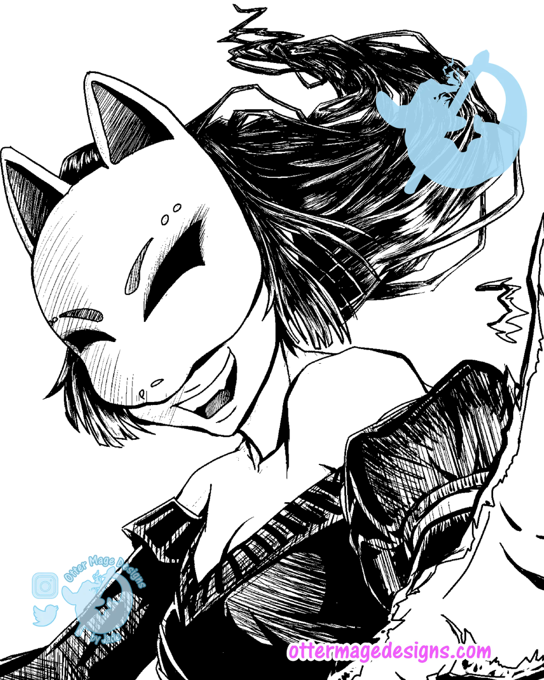
I ran headfirst into that issue this week while drawing my new OFFstream manga one-shot. I’m entering a manga competition with an aggressive deadline, and I knew I would need to rely on my non-existent screentone skills to bring the story to life.
I started experimenting with my new skills on the big splash page of Kurotsuki hovering over Kyoto. But no matter what I tried on her hair, it looked flat. It instantly reminded me of those manga titles where the time pinch resulted in flat screentones that pull us right out of the story.
I was not going to let that happen to this one-shot!
So I got up, grabbed a soda, cussed, and made the call.
I spent forty minutes inking her hair to a Spotify playlist called Angry Emo Dumpsterfire Punk Pop. For context: screentone application takes under one minute.
That’s the tightrope manga artists walk. There is always a trade-off to get pages out on time.
Want the full story and art breakdown?
I’m pulling back the curtain onPatreon with the complete breakdown of this page!
Head over to read the full post, including:
The Optical Illusion Explanation: My funhouse and vortex rug visual analogy that makes hatching vs. screentone instantly click.
Before & After Art Showcase: See the exact side-by-side difference between the flat screentone hair and the 40-minute inked hair.
The Industry Secret: Why published manga artists save crosshatching for climactic spreads while leaving background panels flat.